• Skip to primary navigation
  • Skip to main content
  • Skip to footer
OMA Comp

OMA Comp

Web Design & Development

  • Home
  • About
    • Our Culture
    • Client Testimonials
    • Photo Gallery
    • Video Testimonials
  • Services
    • Web & Creative
      • Custom App Design
      • Drone Services
      • Graphic Design
      • Logo Design
      • Online Stores
      • Photography/Videography
      • Video Production
      • Web Design/Development
    • Digital Marketing
      • Advertising & Paid Search (PPC)
      • B2B Marketing
      • Content Marketing
      • Email Marketing
      • Press Releases & Public Relations
      • Social Media Management
    • SEO & Online Visibility
      • Local SEO
      • Reputation Management & Repair
      • Search Engine Optimization (SEO)
      • Website Compliance (ADA, WCAG)
    • Technology & IT Solutions
      • Cloud Solutions
      • Custom Integrations
      • IT Support & Maintenance
      • Network Setup & Security
      • Managed Hosting
    • Strategy & Consulting
      • Analytics & Reporting
      • Marketing Strategy Development
      • Training & Support
      • Website & Brand Review
      • Social Media Boot Camp Classes
      • Events
  • Portfolio
  • Blog
  • Contact
    • Careers
    • Internships
    • Review Us
  • Online Bill Pay
  • Request a Quote
  • 248-616-3057

Blog

How To Turn Website Visitors Into Phone Calls and Form Submissions

May 22, 2026

Table of Contents
  • Start With a Clear Headline
  • Make Your Phone Number Easy to Find
  • Use Strong Calls to Action
  • Keep Forms Simple
  • Build Trust Before Asking for Action
  • Create Service Pages That Answer Real Questions
  • Improve Page Speed
  • Make the Website Mobile-Friendly
  • Use Internal Links to Guide Visitors
  • Add Calls to Action Throughout the Page
  • Track What Is Working
  • Final Thoughts

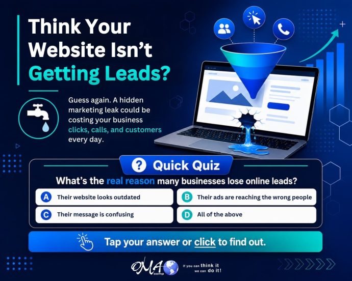
Getting people to visit your website is important, but traffic alone does not grow your business. The real goal is to turn visitors into leads. That means phone calls, form submissions, appointment requests, quote requests, and other meaningful actions.

If your website gets traffic but does not generate enough leads, the issue may not be visibility. It may be conversion. Your website needs to make visitors feel confident, answer their questions, and guide them toward action.

Here are key ways to turn more website visitors into phone calls and form submissions.

Start With a Clear Headline

When someone lands on your website, they should immediately understand what you do. Your headline should be clear, not clever or vague.

A strong headline tells visitors they are in the right place. It should communicate your service, audience, and value.

For example, instead of saying “Solutions Built for You,” a stronger headline might say, “Website Design and Digital Marketing That Help Local Businesses Generate More Leads.”

Clarity creates confidence. Confident visitors are more likely to take action.

Make Your Phone Number Easy to Find

If phone calls are important to your business, your phone number should be visible. Do not hide it only on the contact page.

Place your phone number in the header, footer, and mobile menu. On mobile devices, make sure the phone number is clickable. A visitor should be able to tap once and call.

This is especially important for service businesses, medical offices, contractors, law firms, restaurants, and any business that relies on quick customer response.

Use Strong Calls to Action

A call to action tells visitors what to do next. Without a clear call to action, people may browse your site and leave.

Strong calls to action include:

Call Now

Request a Quote

Schedule a Consultation

Book an Appointment

Contact Our Team

Get Started Today

The wording should match the type of lead you want. If your sales process begins with a conversation, encourage visitors to call. If you need project details first, guide them to a form.

Keep Forms Simple

Long forms can reduce submissions. If a form asks for too much information too soon, visitors may abandon it.

A good lead form should be simple and focused. Ask for the information you truly need to start the conversation. This may include name, phone number, email, service needed, and a short message.

You can always gather more details after the first contact. The main goal is to make the first step easy.

Build Trust Before Asking for Action

People are more likely to contact a business when they trust it. Your website should include trust signals near calls to action.

Trust signals may include:

Customer reviews

Testimonials

Case studies

Portfolio examples

Certifications

Awards

Years in business

Professional photos

Team information

These details reassure visitors that your business is legitimate and capable.

Create Service Pages That Answer Real Questions

Many visitors arrive with specific needs. If your website only has a general services page, you may miss opportunities to connect with them.

Individual service pages help visitors find the exact solution they need. They also support SEO by targeting specific search terms.

Each service page should explain the problem, the service, the benefits, your process, and the next step. It should also include a clear call to action.

For example, OMA Comp uses website design, SEO, and digital advertising pages to explain different services clearly and guide visitors toward the right solution.

Improve Page Speed

A slow website can cost you leads. If visitors have to wait too long, they may leave before seeing your content or contacting you.

Page speed can be improved by compressing images, cleaning up unnecessary code, using better hosting, removing unused plugins, and optimizing scripts.

A faster site creates a better user experience and helps visitors move smoothly toward action.

Make the Website Mobile-Friendly

Many visitors will contact your business from their phone. If your website is difficult to use on mobile, you may lose leads.

Your mobile site should include readable text, simple navigation, clickable buttons, fast loading, and easy forms. Calls to action should be visible without requiring users to search.

A strong mobile experience can directly increase phone calls and form submissions.

Use Internal Links to Guide Visitors

Internal links help move visitors from one page to another. They can also support SEO and help users learn more about your services.

For example, a blog post about website conversions can link to your website design services, SEO services, and contact page. These links give visitors a clear path to continue engaging with your business.

Internal linking should feel natural and helpful.

Add Calls to Action Throughout the Page

Do not place one button at the bottom and hope visitors find it. Some people are ready to act quickly. Others need more information first.

Include calls to action near the top, after important sections, and at the end of the page. This gives visitors multiple opportunities to take the next step.

Track What Is Working

To improve conversions, you need to understand visitor behavior. Tracking phone calls, form submissions, button clicks, and page performance can reveal what is working and what needs attention.

Analytics can help identify high-traffic pages that are not converting, forms that may be too long, or calls to action that need improvement.
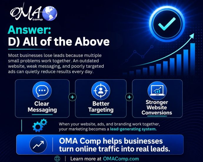
Final Thoughts

Turning website visitors into phone calls and form submissions requires more than traffic. It takes clear messaging, strong design, simple navigation, trust-building content, and easy calls to action.

OMA Comp helps businesses create websites and marketing systems that turn online attention into real leads. If your website is getting visitors but not enough calls or submissions, it may be time to improve your conversion strategy.

Visit our contact page to start the conversation and learn how OMA Comp can help your website work harder for your business.

Filed Under: Blogging Tagged With: conversion rate optimization, form submissions, lead generation, OMA Comp, phone calls, website leads, website strategy

Why Your Business May Be Losing Leads Online Without Realizing It

May 21, 2026

Businesses often attribute poor lead generation to simple causes like website design or ad spend, but the deeper issue is typically a combination of small gaps across the entire marketing system. Visitors may reach a website and leave quickly when messaging, trust signals, or calls to action fall short.

Effective lead generation requires alignment across websites, ads, branding, content, and follow-up processes. When these elements work together as a unified system, businesses are better positioned to convert online attention into measurable results.

Many business owners assume that if they are not getting enough leads, the problem must be simple.

  • Maybe the website needs a new look.
  • Maybe the ads need more money.
  • Maybe people are not ready to buy.
  • Maybe the market is slow.

While any of those can play a role, the real issue is often deeper. Most businesses lose online leads because their marketing system has too many small gaps working against them at the same time.

A visitor may click your ad, land on your website, skim the page for a few seconds, and leave without calling. That might feel like a lost opportunity, but it is also valuable information. Something in the process did not give them enough confidence to take the next step.

At OMA Comp, we look at digital marketing as more than just a website, ad campaign, or social media post. We look at the full path a customer takes from first impression to final decision.

The Hidden Lead Leak Most Businesses Miss

The biggest lead problem is not always traffic. It is often conversion.

A business may already be getting people to its website, Facebook page, Google profile, or landing pages. The issue is that those visitors are not turning into calls, form submissions, appointments, or purchases.

That can happen when:

  • The message does not clearly explain what the business does.
  • The website does not quickly build trust.
  • The call to action is hard to find.
  • The design looks outdated or cluttered.
  • The ads attract clicks from people who are not the right fit.
  • The content does not answer the customer’s real questions.
  • The business does not show enough proof, reviews, photos, services, or benefits.
  • Each issue may seem small on its own. Together, they can quietly reduce your results every day.

Why “Looking Good” Is Not Enough

A good-looking website is important, but design alone does not create leads.

Your website must also communicate clearly. Within seconds, visitors should understand who you help, what you offer, why they should trust you, and what to do next.

If someone has to search too hard for your phone number, service areas, pricing information, contact form, or main services, they may leave and choose a competitor instead.

Strong marketing design is not just about appearance. It is about guiding people toward action.

Your Ads May Be Working Harder Than They Should

Paid ads can bring traffic fast, but they cannot fix a weak website or unclear offer.

If your Google Ads, Facebook Ads, or social media campaigns are sending people to a page that does not convert, you may end up paying for attention without getting enough results.

That is why your ads, landing pages, graphics, copy, and calls to action need to work together.

A strong marketing system connects every piece:

  • The ad catches attention.
  • The message creates interest.
  • The landing page builds trust.
  • The call to action makes the next step easy.
  • The follow-up turns the lead into a customer.
  • When one piece is weak, the whole system suffers.

Clear messaging makes your business easier to understand and easier to trust.

The Real Answer: Your Marketing Needs to Work as a System

The correct quiz answer is D) All of the above because lead generation is rarely about one isolated issue.

Clear Messaging Builds Confidence

Customers do not want to work hard to figure out why they should choose you.

They want clear answers.

  • What do you offer?
  • Who do you help?
  • What problem do you solve?
  • Why are you different?
  • How do they get started?

If your marketing does not answer those questions quickly, visitors may hesitate. Hesitation often leads to lost leads.

A successful online presence includes:

  • A professional website
  • Strong branding
  • Clear service pages
  • Local SEO
  • Google Business Profile optimization
  • Paid advertising
  • Social media content
  • Lead-focused graphics
  • Trust-building copy
  • Conversion-friendly calls to action
  • Consistent follow-up

When these pieces are aligned, your business has a much better chance of turning online attention into real opportunities.

How OMA Comp Helps Businesses Capture More Leads

OMA Comp helps businesses improve their digital presence by looking at the full marketing picture. Instead of focusing on one piece alone, we help create stronger websites, better content, more effective advertising, cleaner design, and clearer messaging.

The goal is simple: help more of the right people find your business, understand your value, and take action.

Whether your website needs improvement, your ads need better direction, your content needs a stronger message, or your overall marketing needs a more strategic plan, OMA Comp can help build a system that works harder for your business.

Final Takeaway

If your business is getting traffic but not enough leads, the problem may not be one obvious issue.

It may be a hidden lead leak caused by unclear messaging, weak design, poor targeting, low trust, or an incomplete marketing system.

The good news is that those problems can be fixed.

When your website, ads, branding, content, and strategy work together, your marketing becomes more than just online activity. It becomes a lead-generating system built to support real business growth.

Filed Under: News Tagged With: Digital Marketing, lead generation, online marketing

Website Design Mistakes That Make Customers Leave

May 20, 2026

Common website design mistakes — including cluttered homepages, unclear messaging, slow load times, and missing calls to action — can cause visitors to leave before taking any action. Poor mobile design and hard-to-find contact information further reduce the chance of converting visitors into leads.

Additional factors such as low-quality images, absent trust signals, unstructured page layouts, and a lack of lead strategy can undermine credibility and business results. Addressing these issues through intentional design can improve user experience, build trust, and increase the number of visitors who contact or engage with a business.

Table of Contents
  • Start With a Clear Headline
  • Make Your Phone Number Easy to Find
  • Use Strong Calls to Action
  • Keep Forms Simple
  • Build Trust Before Asking for Action
  • Create Service Pages That Answer Real Questions
  • Improve Page Speed
  • Make the Website Mobile-Friendly
  • Use Internal Links to Guide Visitors
  • Add Calls to Action Throughout the Page
  • Track What Is Working
  • Final Thoughts
Woman sitting on the floor with a laptop, frustrated with hands on her head, surrounded by cardboard boxes

Website Design Mistakes That Make Customers Leave

Your website has only a short amount of time to make a strong impression. When someone lands on your site, they are quickly deciding whether your business feels credible, helpful, and easy to work with.

Good website design does more than look nice. It guides visitors, builds trust, answers questions, and encourages action. Poor design can do the opposite. It can confuse visitors, frustrate them, and cause them to leave before they ever call or submit a form.

Here are some of the most common website design mistakes that make customers leave.

Mistake 1: A Cluttered Homepage

A cluttered homepage can overwhelm visitors. Too much text, too many buttons, too many images, and too many competing messages can make it hard for people to know where to focus.

Your homepage should have a clear purpose. Visitors should immediately understand what your business does, who you help, and what step they should take next.

A clean homepage should include a strong headline, a short explanation, clear calls to action, key services, trust signals, and easy navigation. Everything should work together instead of competing for attention.

Mistake 2: Weak or Confusing Messaging

Design and messaging are connected. Even a beautiful website can fail if the words are unclear.

Customers are usually looking for answers:

What do you do?

Can you solve my problem?

Do you serve my area?

Why should I trust you?

How do I get started?

If your website does not answer these questions quickly, visitors may leave and choose a competitor. Clear messaging should be specific, customer-focused, and easy to understand.

Instead of saying “We provide quality solutions,” explain the actual value. For example, “We help local businesses improve their websites, increase visibility, and generate more qualified leads.”

Mistake 3: Poor Mobile Design

A website may look great on a desktop but fail on a phone. This is a major problem because many users browse, research, and contact businesses from mobile devices.

Poor mobile design includes tiny text, crowded layouts, buttons that are hard to tap, images that load incorrectly, and forms that are difficult to complete.

Mobile design should be simple and conversion-focused. Phone numbers should be clickable. Forms should be short. Important information should be easy to find without endless scrolling.

Mistake 4: Slow Page Speed

Customers do not want to wait for a website to load. Slow pages create frustration and reduce trust.

Large images, poor hosting, unnecessary plugins, and outdated website code can all hurt speed. A slow website can make visitors feel like your business is not current or professional.

Improving speed can help create a smoother experience and support better conversion rates. OMA Comp can review website performance as part of a broader website design and development strategy.

Mistake 5: No Clear Call to Action

Every important page on your website should clearly guide the visitor toward a meaningful next step. Whether that means signing up for a newsletter, making a purchase, booking a consultation, or simply reading another article, each page needs a defined purpose and a clear direction. If your website does not tell people what to do, many will leave without taking any action at all — not because they aren’t interested, but simply because they weren’t given a clear path to follow. Think of your website as a conversation. Just as a good salesperson or customer service representative naturally leads someone toward a decision, your pages should do the same through well-placed calls to action, intuitive navigation, and purposeful content. Visitors often arrive on your site without a fully formed plan, and a gentle, well-timed prompt can be the difference between a conversion and a missed opportunity. Even small, low-commitment actions — like clicking a button to learn more or downloading a free resource — can keep visitors engaged and move them further along the journey.

A strong call to action should be simple and direct:

  • Call Today
  • Request a Quote
  • Schedule a Consultation
  • Get Started
  • Contact Our Team

Your call to action should appear near the top of the page and again throughout the page when appropriate. The goal is to reduce friction and make it easy for visitors to respond.

Mistake 6: Hard-to-Find Contact Information

If someone is ready to contact your business, do not make them search. Your phone number, contact form, address, and hours should be easy to locate.

For local businesses, contact information should be visible in the header, footer, and contact page. Clickable phone numbers are especially important on mobile.

If users cannot quickly figure out how to reach you, they may go back to Google and choose another company.

Mistake 7: Poor Use of Images

Images can improve a website, but only if they support the message. Low-quality images, generic stock photos, stretched graphics, or outdated visuals can hurt credibility.

Strong images should feel professional, relevant, and authentic. Real photos of your team, work, location, products, or process can help build trust.

Good visual design helps visitors feel more connected to your business.

Mistake 8: Missing Trust Signals

People want confidence before they take action. If your website does not show proof, visitors may hesitate.

Trust signals include reviews, testimonials, certifications, awards, case studies, portfolio images, partner logos, before-and-after examples, and years of experience.

These details show that your business is active, capable, and reliable.

Mistake 9: Poor Page Structure

A well-designed page should be easy to scan. Many visitors do not read every word. They look at headings, short sections, images, buttons, and key points.

If your pages are long blocks of text with no structure, people may leave. Use clear headings, short paragraphs, and organized sections to improve readability.

Good structure helps visitors understand your message faster.

Mistake 10: Designing Without a Lead Strategy

A website should not just look good. It should support business goals. If your site is not designed around lead generation, it may fail to produce results.

A lead-focused website includes strong service pages, clear calls to action, helpful content, trust signals, simple forms, and strong SEO structure.

For more guidance, visit our internal page on digital marketing services to see how website design, ads, SEO, and branding work together.

Futuristic website performance dashboard showing traffic metrics, processing load, illustrating the importance of page speed optimization.

Final Thoughts

Website design mistakes can quietly push customers away. A cluttered layout, unclear message, slow speed, poor mobile experience, or weak call to action can all reduce leads.

The good news is that these issues can be fixed. With a better design strategy, your website can become easier to use, more trustworthy, and more effective at turning visitors into customers.

OMA Comp helps businesses build websites that look professional and work strategically. A better website can help your business create stronger first impressions and generate more real leads.

Filed Under: Blogging Tagged With: business website, lead generation, OMA Comp, user experience, web design, website conversions, website design mistakes

Outdated Website Signs That Could Be Hurting Your Sales

May 18, 2026

Table of Contents
  • Start With a Clear Headline
  • Make Your Phone Number Easy to Find
  • Use Strong Calls to Action
  • Keep Forms Simple
  • Build Trust Before Asking for Action
  • Create Service Pages That Answer Real Questions
  • Improve Page Speed
  • Make the Website Mobile-Friendly
  • Use Internal Links to Guide Visitors
  • Add Calls to Action Throughout the Page
  • Track What Is Working
  • Final Thoughts

Your website is often the first impression people have of your business. Before they call, visit, book, or request a quote, they usually check your website to decide if your company feels trustworthy, professional, and easy to work with.

If your website looks outdated, loads slowly, or makes it hard for visitors to take action, it may be hurting your sales without you realizing it. A website does not need to be broken to lose business. Sometimes, small issues work together and quietly reduce leads every day.

Your Website Looks Visually Dated

Design trends change, but more importantly, customer expectations change. If your site looks like it was built years ago and has not been refreshed, visitors may assume your business is behind as well.

Outdated fonts, crowded layouts, old graphics, low-quality photos, and inconsistent colors can make your brand feel less credible. Even if your services are excellent, a dated website can create doubt before a visitor ever contacts you.

A modern website should feel clean, organized, and easy to scan. It should quickly show who you are, what you offer, and why someone should choose your business.

Your Website Is Not Mobile Friendly

Many customers visit websites from their phones. If your site is hard to read, requires pinching and zooming, or has buttons that are difficult to tap, visitors may leave quickly.

A mobile-friendly website should adjust naturally to smaller screens. Text should be readable, images should resize properly, and calls to action should be easy to find. If someone wants to call your business, the phone number should be simple to tap.

For many local businesses, mobile visitors are high-intent visitors. They may be ready to call, schedule, or get directions. A poor mobile experience can mean lost leads.

Your Website Loads Too Slowly

Speed matters. If your site takes too long to load, visitors may not wait. Slow websites can also hurt user experience and reduce conversions.

Large images, outdated plugins, poor hosting, old code, and unnecessary scripts can all slow a website down. A fast website helps users move smoothly from interest to action.

If your website feels sluggish, it may be time for a performance review. OMA Comp can help identify technical issues that may be holding your site back. Learn more through our internal page on website design and development.

Your Messaging Is Unclear

A visitor should be able to understand your business within seconds. If your homepage does not clearly explain what you do, who you help, and what action someone should take next, your messaging may be costing you leads.

Many outdated websites are filled with generic statements like “quality service” or “trusted professionals” without clearly showing value. Strong messaging focuses on the customer’s problem and explains how your business solves it.

Clear messaging helps people feel confident. Confused visitors rarely convert.

Your Calls to Action Are Weak or Missing

A website should guide visitors toward the next step. That could be calling, requesting a quote, scheduling a consultation, filling out a form, or visiting a location.

If your website does not have strong calls to action, people may browse and leave. A call to action should be visible, direct, and repeated throughout important pages.

Examples include:

“Request a Free Consultation”

“Call Today”

“Schedule Your Appointment”

“Get a Quote”

“Talk With Our Team”

The goal is to make action easy.

Your Content Is Old or Thin

Outdated service pages, old blog posts, missing location pages, and weak descriptions can hurt both search visibility and customer trust. If your content no longer reflects your current services, pricing approach, service area, or brand voice, your website may be creating confusion.

Fresh, helpful content can support SEO and help customers make better decisions. Blog posts, FAQs, service pages, and case studies can all improve engagement.

For more on this, see our internal resource on SEO content strategy.

Your Website Does Not Build Trust

Customers want proof before they contact a business. If your website is missing testimonials, reviews, project examples, team information, awards, certifications, or strong photos, visitors may hesitate.

Trust signals help people feel safe choosing your company. An updated website should show credibility clearly and naturally.

Your Site Is Hard to Navigate

If visitors cannot find what they need quickly, they may leave. Navigation should be simple, with clear pages for services, about, contact, locations, and important resources.

Too many menu items can feel overwhelming. Too few can make the site feel incomplete. A good website structure helps both users and search engines understand your business.

Your Website Is Not Turning Traffic Into Leads

Getting traffic is only part of the goal. Your website should turn that traffic into real opportunities. If people visit your site but do not call, submit forms, or take the next step, the issue may be your design, messaging, layout, speed, or offer.

OMA Comp helps businesses improve the full digital experience, from design and SEO to ads and conversion strategy. Visit our digital marketing services page to learn how we help businesses turn online traffic into real leads.

Final Thoughts

An outdated website can quietly reduce sales, even when your business is doing great work. If your site looks old, loads slowly, has unclear messaging, or does not guide visitors toward action, it may be time for a refresh.

Your website should work as a lead-generating tool, not just an online brochure. With the right design, content, and strategy, your website can help build trust, improve engagement, and create more opportunities for your business.

Filed Under: Blogging Tagged With: Digital Marketing, lead generation, OMA Comp, outdated website, website design, website redesign, website sales

Fueling the Future: Andrew Bogusz’s Road to IndyCar

May 7, 2026

At OMA Comp, we believe in the power of precision, dedication, and the relentless pursuit of excellence. These are the same values that drive 20-year-old racing sensation Andrew Bogusz.

Today, we are thrilled to announce that OMA Comp is officially endorsing Andrew and launching a complimentary marketing campaign to help propel him toward his ultimate goal: the IndyCar circuit.

Fuel the Dream – Sponsor Andrew Bogusz

Support Andrew Bogusz

The Driver Behind the Wheel

Andrew isn’t just a driver; he’s a Mechanical Engineering student at Lawrence Technological University. This unique combination of technical expertise and raw talent on the track gives him a competitive edge that is rare in the world of motorsports. For the 2026 season, he is tackling the Tri-State Sprint Series and the weekly series at Grand Bend Speedway.

How You Can Help:

Racing at this level requires immense support. If you want to be part of the team that puts Andrew in the winner’s circle, please consider reaching out for sponsorship opportunities.

Official Website: www.andrewbogusz.com

Follow Andrew’s Journey:

  • LinkedIn: https://www.linkedin.com/in/andrew-bogusz-b7267b297/
  • Instagram/YouTube/Facebook: @andrewbogusz
  • TikTok: @andrew_bogusz

Filed Under: News

Protecting Teens Online: Why Social Media Boundaries Matter More Than Ever

April 3, 2026

Table of Contents
  • Start With a Clear Headline
  • Make Your Phone Number Easy to Find
  • Use Strong Calls to Action
  • Keep Forms Simple
  • Build Trust Before Asking for Action
  • Create Service Pages That Answer Real Questions
  • Improve Page Speed
  • Make the Website Mobile-Friendly
  • Use Internal Links to Guide Visitors
  • Add Calls to Action Throughout the Page
  • Track What Is Working
  • Final Thoughts

For years, concerns about teenagers and social media were often dismissed as overreactions or simply “part of growing up in a digital world.” But now, after years of rising concern from parents, educators, psychologists, and researchers, we are finally starting to see meaningful action.

It is long overdue.

Countries like Australia have begun introducing stronger rules and discussions around youth access to social media, and other governments are beginning to follow. At the same time, social media platforms continue to resist stricter oversight. That should not surprise anyone. Attention is the product, and engagement is the business model.

As a marketing company, we understand the power and value of digital platforms. Social media can be an incredible tool for communication, brand growth, education, and connection. But we also understand something equally important: developing minds should not be shaped primarily by algorithms.

That is where the conversation needs to become more honest.

Why Teen Social Media Use Has Become a Serious Concern

Teenagers are still forming their identity, emotional resilience, and sense of self. During those years, they need real world input to grow in healthy ways. They need conversations, challenges, friendships, mentorship, family interaction, boredom, creativity, and face to face experiences.

What they do not need is for much of that development to be filtered through endless curated feeds, unrealistic comparisons, and dopamine driven content loops.

The issue is no longer whether social media has an impact. The issue is how much of an impact we are willing to ignore.

What the Research Continues to Show

The growing body of research around youth and social media is difficult to overlook. While not every teen is affected in the same way, the patterns are concerning enough that they deserve serious attention.

Researchers and mental health professionals continue to point to several major concerns:

  • Excessive social media use has been linked to increased rates of anxiety, depression, and sleep disruption in teenagers
  • Early and repeated exposure to unrealistic beauty standards, lifestyle expectations, and social comparisons can negatively affect self esteem and identity development
  • Algorithms often reward extreme, emotionally charged, or harmful content because it drives stronger engagement

That last point matters more than most people realize.

Social media platforms are not designed around what is healthiest. They are designed around what keeps people watching, scrolling, reacting, and returning.

For adults, that can already be difficult to manage. For teenagers, it can be far more damaging.

Why This Responsibility Cannot Fall on One Group Alone

Protecting teens online is not just a parenting issue. It is not just a platform issue. And it is not just a policy issue.

It is all of those things at once.

If meaningful change is going to happen, it has to happen on multiple levels.

Lawmakers Need to Set Boundaries

Technology evolves quickly, but that cannot become an excuse for doing nothing. Clear rules around age access, platform responsibility, data usage, and youth protections are necessary.

Platforms Need Accountability

Social media companies should not be allowed to hide behind innovation while knowingly building systems that reward compulsive use and harmful content exposure.

Schools Need Better Digital Education

Students need more than warnings. They need practical education about digital habits, online manipulation, algorithmic influence, and mental health awareness.

Parents and Guardians Need to Stay Involved

This is where the most immediate influence still exists. Parents and caregivers cannot control everything, but they can shape the environment, set expectations, model behavior, and stay engaged.

That role matters more than ever.

Why the Fight Feels So Difficult

One reason this issue feels overwhelming is because it is.

Technology changes faster than regulation. Social media is deeply woven into how young people communicate and socialize. And behind it all are some of the most powerful business incentives in the world, all centered around keeping users engaged for as long as possible.

Especially younger users.

That makes this a difficult fight.

But difficult does not mean optional.

If we want the next generation to grow into resilient, thoughtful, emotionally grounded adults, we cannot outsource their development to screens and algorithms.

We have to stay involved.

We have to keep asking hard questions.

And we have to stop pretending that convenience is the same thing as safety.

Final Thoughts

This conversation is not about rejecting technology. It is not about fear. And it is not about pretending social media has no place in modern life.

It is about balance, responsibility, and protection.

We do not need to be anti technology.

We need to be pro child.

Filed Under: News

  • Page 1
  • Page 2
  • Page 3
  • Interim pages omitted …
  • Page 104
  • Go to Next Page »

Footer

Contact Information


OMA Comp

318 Woodlawn Avenue
Royal Oak, MI 48073-2615

Phone: 248-616-3057
Fax: 248-232-0075

Review Us | Request A Quote

Contact Us

Recent Posts

  • How To Turn Website Visitors Into Phone Calls and Form Submissions
  • Why Your Business May Be Losing Leads Online Without Realizing It
  • Website Design Mistakes That Make Customers Leave
  • Outdated Website Signs That Could Be Hurting Your Sales
  • Fueling the Future: Andrew Bogusz’s Road to IndyCar

Newsletter Signup

Subscribe below to hear about our latest product offerings and promotions.

Subscribe

Connect With Us

  • Facebook
  • Instagram
  • LinkedIn
  • Twitter
  • YouTube

Copyright © 2026 OMA Comp · Repair Policies · Terms and Conditions · Privacy Policy · Service Ticket

  • Phone: (248) 616-3057
  • Review Us
  • Newsletter Sign Up
Accessibility Adjustments

Powered by OneTap

How long do you want to hide the toolbar?
Hide Toolbar Duration
Select your accessibility profile
Vision Impaired Mode
Enhances website's visuals
Seizure Safe Profile
Clear flashes & reduces color
ADHD Friendly Mode
Focused browsing, distraction-free
Blindness Mode
Reduces distractions, improves focus
Epilepsy Safe Mode
Dims colors and stops blinking
Content Modules
Font Size

Default

Line Height

Default

Color Modules
Orientation Modules