• Skip to primary navigation
  • Skip to main content
  • Skip to footer
OMA Comp

OMA Comp

Web Design & Development

  • Home
  • About
    • Our Culture
    • Client Testimonials
    • Photo Gallery
    • Video Testimonials
  • Services
    • Web & Creative
      • Custom App Design
      • Drone Services
      • Graphic Design
      • Logo Design
      • Online Stores
      • Photography/Videography
      • Video Production
      • Web Design/Development
    • Digital Marketing
      • Advertising & Paid Search (PPC)
      • B2B Marketing
      • Content Marketing
      • Email Marketing
      • Press Releases & Public Relations
      • Social Media Management
    • SEO & Online Visibility
      • Local SEO
      • Reputation Management & Repair
      • Search Engine Optimization (SEO)
      • Website Compliance (ADA, WCAG)
    • Technology & IT Solutions
      • Cloud Solutions
      • Custom Integrations
      • IT Support & Maintenance
      • Network Setup & Security
      • Managed Hosting
    • Strategy & Consulting
      • Analytics & Reporting
      • Marketing Strategy Development
      • Training & Support
      • Website & Brand Review
      • Social Media Boot Camp Classes
      • Events
  • Portfolio
  • Blog
  • Contact
    • Website Design Form
    • Careers
    • Internships
    • Review Us
  • Online Bill Pay
  • Request a Quote
  • 248-616-3057

Responsive Design Allows Your Website to Fit All Screens

November 26, 2013

When it comes to your website, a responsive design means that no matter what size screen your visitors happen to be using, the design will respond to it and size the view to include the entire page. In simpler terms this simply means that the design takes note of the width and height of your screen or more accurately the size of the viewable area within the web browser being used. It then adjusts the layout of the website. This is done to ensure that the viewer can see everything you, as the site owner, want them to see.
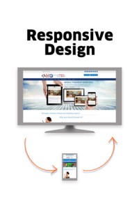
oma-comp-responsive-design-graphic-11-26-2013

Going Mobile

One of the best possible examples of responsive design is the current trend towards the use of mobile devices. For many years all website design focused heavily on accommodating desktop computer screens. As the trend towards mobile devices has led to ever shrinking screen sizes the need for websites to take this into account has increased. Today more people are surfing the web using smartphones, tablets, and laptops. If your website is not optimized to take all of these different devices into account you will lose the opportunity to take advantage of a rapidly growing number of clients.

Responsive, Liquid, and Fixed Layouts

In the early days of the Internet websites made use of liquid layouts. These web pages were designed to flex in order to fit the size of the screen. In most cases this meant stretching the width of the page to fit the screen. While this type of design is still in use today, it has never truly gained in popularity in comparison to the fixed layout in use on many websites today. The liquid layout has become very popular for use on mobile devices as it lets the web page adapt to the size of the screen. However, this does not allow it to adapt fully to the size of a desktop or laptop screen. This is where responsive design comes into play as it allows the website to adapt to the screen or more accurately the browser. This ensures that no matter what your visitor is using they will be able to see your web pages clearly and be able to easily navigate their way around.


OMA Comp has full responsive capabilities with their website development branch. If you’re interested in bringing your website into the “now” rather than leaving it in the “then”, call us today and we’ll set you up with everything you need. If you can think it, we can do it. 248-616-3057

Share this:

  • Click to share on Facebook (Opens in new window) Facebook
  • Click to share on X (Opens in new window) X
  • Click to share on LinkedIn (Opens in new window) LinkedIn

Filed Under: News Tagged With: Blogging, Comp, E-commerce, Fitness/Wellness, Industrial, Internet, Legal, Media, Medical Website, Non-profit, OMA, Restaurant/Café, Services, Social, social media, Technology, web design, Web Site, website development, website redesign

Footer

Contact Information


OMA Comp

318 Woodlawn Avenue
Royal Oak, MI 48073-2615

Phone: 248-616-3057
Fax: 248-232-0075

Review Us | Request A Quote

Contact Us

Recent Posts

  • Why Every Business Needs a Strong Local SEO Strategy
  • Exploring the New Apple iOS: Key Features, Improvements, and What Users Should Know
  • Boost Your Ad Performance with A/B Testing
  • Boost Sales through Social Media Engagement
  • Why Consistent Branding Builds Customer Trust

Newsletter Signup

Subscribe below to hear about our latest product offerings and promotions.

Subscribe

Connect With Us

  • facebook
  • instagram
  • linkedin
  • yelp
  • x
  • youtube

Copyright © 2025 OMA Comp · Repair Policies · Terms and Conditions · Privacy Policy · Service Ticket

  • Phone: (248) 616-3057
  • Review Us
  • Newsletter Sign Up