
• Skip to primary navigation
  • Skip to main content
  • Skip to footer
OMA Comp

OMA Comp

Web Design & Development

  • Home
  • About
    • Our Culture
    • Client Testimonials
    • Photo Gallery
    • Video Testimonials
  • Services
    • Web & Creative
      • Custom App Design
      • Drone Services
      • Graphic Design
      • Logo Design
      • Online Stores
      • Photography/Videography
      • Video Production
      • Web Design/Development
    • Digital Marketing
      • Advertising & Paid Search (PPC)
      • B2B Marketing
      • Content Marketing
      • Email Marketing
      • Press Releases & Public Relations
      • Social Media Management
    • SEO & Online Visibility
      • Local SEO
      • Reputation Management & Repair
      • Search Engine Optimization (SEO)
      • Website Compliance (ADA, WCAG)
    • Technology & IT Solutions
      • Cloud Solutions
      • Custom Integrations
      • IT Support & Maintenance
      • Network Setup & Security
      • Managed Hosting
    • Strategy & Consulting
      • Analytics & Reporting
      • Marketing Strategy Development
      • Training & Support
      • Website & Brand Review
      • Social Media Boot Camp Classes
      • Events
  • Portfolio
  • Blog
  • Contact
    • Careers
    • Internships
    • Review Us
  • Online Bill Pay
  • Request a Quote
  • 248-616-3057

website conversions

Website Design Mistakes That Make Customers Leave

May 20, 2026

Common website design mistakes — including cluttered homepages, unclear messaging, slow load times, and missing calls to action — can cause visitors to leave before taking any action. Poor mobile design and hard-to-find contact information further reduce the chance of converting visitors into leads.

Additional factors such as low-quality images, absent trust signals, unstructured page layouts, and a lack of lead strategy can undermine credibility and business results. Addressing these issues through intentional design can improve user experience, build trust, and increase the number of visitors who contact or engage with a business.

Table of Contents
  • Website Design Mistakes That Make Customers Leave
    • Mistake 1: A Cluttered Homepage
    • Mistake 2: Weak or Confusing Messaging
    • Mistake 3: Poor Mobile Design
    • Mistake 4: Slow Page Speed
    • Mistake 5: No Clear Call to Action
    • Mistake 6: Hard-to-Find Contact Information
    • Mistake 7: Poor Use of Images
    • Mistake 8: Missing Trust Signals
    • Mistake 9: Poor Page Structure
    • Mistake 10: Designing Without a Lead Strategy
    • Final Thoughts
Woman sitting on the floor with a laptop, frustrated with hands on her head, surrounded by cardboard boxes

Website Design Mistakes That Make Customers Leave

Your website has only a short amount of time to make a strong impression. When someone lands on your site, they are quickly deciding whether your business feels credible, helpful, and easy to work with.

Good website design does more than look nice. It guides visitors, builds trust, answers questions, and encourages action. Poor design can do the opposite. It can confuse visitors, frustrate them, and cause them to leave before they ever call or submit a form.

Here are some of the most common website design mistakes that make customers leave.

Mistake 1: A Cluttered Homepage

A cluttered homepage can overwhelm visitors. Too much text, too many buttons, too many images, and too many competing messages can make it hard for people to know where to focus.

Your homepage should have a clear purpose. Visitors should immediately understand what your business does, who you help, and what step they should take next.

A clean homepage should include a strong headline, a short explanation, clear calls to action, key services, trust signals, and easy navigation. Everything should work together instead of competing for attention.

Mistake 2: Weak or Confusing Messaging

Design and messaging are connected. Even a beautiful website can fail if the words are unclear.

Customers are usually looking for answers:

What do you do?

Can you solve my problem?

Do you serve my area?

Why should I trust you?

How do I get started?

If your website does not answer these questions quickly, visitors may leave and choose a competitor. Clear messaging should be specific, customer-focused, and easy to understand.

Instead of saying “We provide quality solutions,” explain the actual value. For example, “We help local businesses improve their websites, increase visibility, and generate more qualified leads.”

Mistake 3: Poor Mobile Design

A website may look great on a desktop but fail on a phone. This is a major problem because many users browse, research, and contact businesses from mobile devices.

Poor mobile design includes tiny text, crowded layouts, buttons that are hard to tap, images that load incorrectly, and forms that are difficult to complete.

Mobile design should be simple and conversion-focused. Phone numbers should be clickable. Forms should be short. Important information should be easy to find without endless scrolling.

Mistake 4: Slow Page Speed

Customers do not want to wait for a website to load. Slow pages create frustration and reduce trust.

Large images, poor hosting, unnecessary plugins, and outdated website code can all hurt speed. A slow website can make visitors feel like your business is not current or professional.

Improving speed can help create a smoother experience and support better conversion rates. OMA Comp can review website performance as part of a broader website design and development strategy.

Mistake 5: No Clear Call to Action

Every important page on your website should clearly guide the visitor toward a meaningful next step. Whether that means signing up for a newsletter, making a purchase, booking a consultation, or simply reading another article, each page needs a defined purpose and a clear direction. If your website does not tell people what to do, many will leave without taking any action at all — not because they aren’t interested, but simply because they weren’t given a clear path to follow. Think of your website as a conversation. Just as a good salesperson or customer service representative naturally leads someone toward a decision, your pages should do the same through well-placed calls to action, intuitive navigation, and purposeful content. Visitors often arrive on your site without a fully formed plan, and a gentle, well-timed prompt can be the difference between a conversion and a missed opportunity. Even small, low-commitment actions — like clicking a button to learn more or downloading a free resource — can keep visitors engaged and move them further along the journey.

A strong call to action should be simple and direct:

  • Call Today
  • Request a Quote
  • Schedule a Consultation
  • Get Started
  • Contact Our Team

Your call to action should appear near the top of the page and again throughout the page when appropriate. The goal is to reduce friction and make it easy for visitors to respond.

Mistake 6: Hard-to-Find Contact Information

If someone is ready to contact your business, do not make them search. Your phone number, contact form, address, and hours should be easy to locate.

For local businesses, contact information should be visible in the header, footer, and contact page. Clickable phone numbers are especially important on mobile.

If users cannot quickly figure out how to reach you, they may go back to Google and choose another company.

Mistake 7: Poor Use of Images

Images can improve a website, but only if they support the message. Low-quality images, generic stock photos, stretched graphics, or outdated visuals can hurt credibility.

Strong images should feel professional, relevant, and authentic. Real photos of your team, work, location, products, or process can help build trust.

Good visual design helps visitors feel more connected to your business.

Mistake 8: Missing Trust Signals

People want confidence before they take action. If your website does not show proof, visitors may hesitate.

Trust signals include reviews, testimonials, certifications, awards, case studies, portfolio images, partner logos, before-and-after examples, and years of experience.

These details show that your business is active, capable, and reliable.

Mistake 9: Poor Page Structure

A well-designed page should be easy to scan. Many visitors do not read every word. They look at headings, short sections, images, buttons, and key points.

If your pages are long blocks of text with no structure, people may leave. Use clear headings, short paragraphs, and organized sections to improve readability.

Good structure helps visitors understand your message faster.

Mistake 10: Designing Without a Lead Strategy

A website should not just look good. It should support business goals. If your site is not designed around lead generation, it may fail to produce results.

A lead-focused website includes strong service pages, clear calls to action, helpful content, trust signals, simple forms, and strong SEO structure.

For more guidance, visit our internal page on digital marketing services to see how website design, ads, SEO, and branding work together.

Futuristic website performance dashboard showing traffic metrics, processing load, illustrating the importance of page speed optimization.

Final Thoughts

Website design mistakes can quietly push customers away. A cluttered layout, unclear message, slow speed, poor mobile experience, or weak call to action can all reduce leads.

The good news is that these issues can be fixed. With a better design strategy, your website can become easier to use, more trustworthy, and more effective at turning visitors into customers.

OMA Comp helps businesses build websites that look professional and work strategically. A better website can help your business create stronger first impressions and generate more real leads.

Filed Under: Blogging Tagged With: business website, lead generation, OMA Comp, user experience, web design, website conversions, website design mistakes

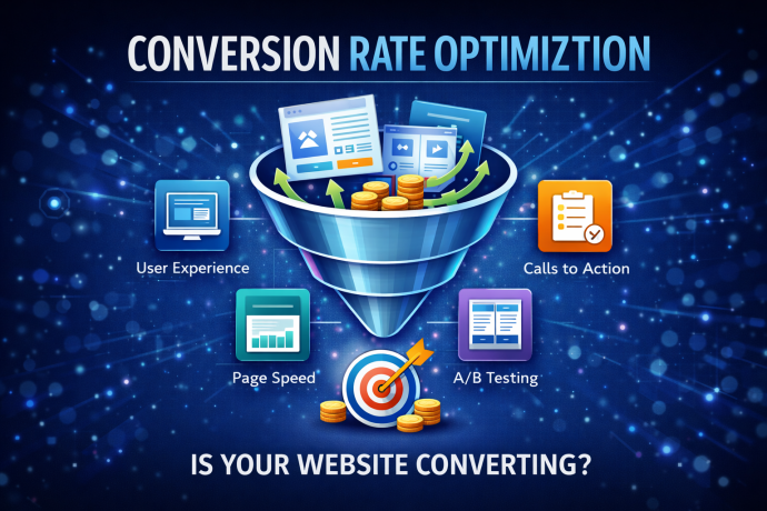
Conversion Rate Optimization Techniques That Deliver Results

February 11, 2026

Table of Contents
  • Website Design Mistakes That Make Customers Leave
    • Mistake 1: A Cluttered Homepage
    • Mistake 2: Weak or Confusing Messaging
    • Mistake 3: Poor Mobile Design
    • Mistake 4: Slow Page Speed
    • Mistake 5: No Clear Call to Action
    • Mistake 6: Hard-to-Find Contact Information
    • Mistake 7: Poor Use of Images
    • Mistake 8: Missing Trust Signals
    • Mistake 9: Poor Page Structure
    • Mistake 10: Designing Without a Lead Strategy
    • Final Thoughts

What Is Conversion Rate Optimization

Conversion rate optimization, often called CRO, focuses on improving the percentage of website visitors who take a desired action. That action may include filling out a form, making a purchase, scheduling a consultation, or signing up for a newsletter.

Instead of spending more money to drive traffic, businesses use CRO techniques to get better results from the traffic they already have. This approach increases efficiency and improves overall marketing return on investment.

Optimize Your Website for User Experience

User experience plays a major role in website conversions. If visitors cannot navigate your site easily, they will leave before taking action.

Start by simplifying navigation. Make sure menus are clear and pages load quickly. Reduce clutter and eliminate unnecessary distractions. A clean layout with strong headlines and clear calls to action helps guide visitors naturally toward conversion.

Mobile optimization is equally important. With most users browsing on smartphones, responsive design ensures your website performs well on every device.

Strengthen Your Calls to Action

Calls to action influence conversion rates more than most businesses realize. Clear, direct language works best. Instead of vague phrases, use action focused wording such as Schedule Your Consultation or Get Your Free Quote.

Placement also matters. Position calls to action above the fold, within content, and at the end of pages. Testing button color, size, and wording can significantly improve click through rates.

Improve Page Load Speed

Website speed directly affects conversion rate optimization. Slow loading pages increase bounce rates and reduce trust.

Optimize images, reduce unnecessary plugins, and use reliable hosting. Even a one second improvement in load time can increase conversions and improve search engine rankings.

Use Data to Guide Decisions

Successful CRO strategies rely on data. Use tools like Google Analytics and heat mapping software to understand how visitors interact with your site.

Identify where users drop off and which pages convert best. A data driven approach removes guesswork and allows you to test changes systematically.

Build Trust With Social Proof

Trust influences purchasing decisions. Adding testimonials, reviews, certifications, and case studies increases credibility.

Place social proof near calls to action to reinforce confidence. When visitors see evidence that others trust your business, they feel more comfortable converting.

Simplify Forms and Checkout Processes

Long or complicated forms discourage conversions. Only ask for essential information. Shorter forms typically generate more leads.

For e commerce websites, streamline the checkout process. Reduce required steps and clearly communicate security measures to build trust.

Test and Refine Continuously

Conversion rate optimization is not a one time project. It requires ongoing testing and refinement.

Run A B tests on headlines, images, layouts, and calls to action. Small changes often lead to measurable improvements over time. Continuous optimization helps businesses stay competitive in evolving markets.

Why CRO Delivers Long Term Results

CRO increases revenue without increasing advertising costs. By improving conversion rates, businesses maximize existing traffic and improve marketing performance.

Instead of chasing more visitors, smart companies focus on converting the audience they already attract.

Final Thoughts

Conversion rate optimization techniques deliver results because they focus on performance, clarity, and user experience. Businesses that invest in CRO create websites that work harder, convert better, and drive measurable growth.

Filed Under: Blogging Tagged With: conversion rate optimization, CRO strategies, digital marketing strategy, lead generation, marketing agency, website conversions

Footer

Contact Information


OMA Comp

318 Woodlawn Avenue
Royal Oak, MI 48073-2615

Phone: 248-616-3057
Fax: 248-232-0075

Review Us | Request A Quote

Contact Us

Recent Posts

  • How To Turn Website Visitors Into Phone Calls and Form Submissions
  • Why Your Business May Be Losing Leads Online Without Realizing It
  • Website Design Mistakes That Make Customers Leave
  • Outdated Website Signs That Could Be Hurting Your Sales
  • Fueling the Future: Andrew Bogusz’s Road to IndyCar

Newsletter Signup

Subscribe below to hear about our latest product offerings and promotions.

Subscribe

Connect With Us

  • Facebook
  • Instagram
  • LinkedIn
  • Twitter
  • YouTube

Copyright © 2026 OMA Comp · Repair Policies · Terms and Conditions · Privacy Policy · Service Ticket

  • Phone: (248) 616-3057
  • Review Us
  • Newsletter Sign Up
Accessibility Adjustments

Powered by OneTap

How long do you want to hide the toolbar?
Hide Toolbar Duration
Select your accessibility profile
Vision Impaired Mode
Enhances website's visuals
Seizure Safe Profile
Clear flashes & reduces color
ADHD Friendly Mode
Focused browsing, distraction-free
Blindness Mode
Reduces distractions, improves focus
Epilepsy Safe Mode
Dims colors and stops blinking
Content Modules
Font Size

Default

Line Height

Default

Color Modules
Orientation Modules